Textpattern CMS support forum
You are not logged in. Register | Login | Help
- Topics: Active | Unanswered
#16 2010-03-09 14:24:11
- uli
- Moderator

- From: Cologne
- Registered: 2006-08-15
- Posts: 4,334
Re: Mild alterations to the Presentation tabs
“How can I delete these comments forms now that they finally got a checkbox?”
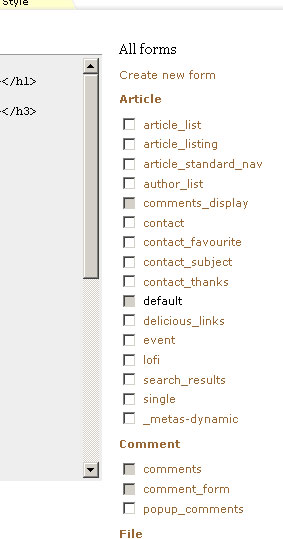
Disabling an element implies that there can be a situation when it is enabled. So it’d be a misleading use of the metaphor “disabled”.
If it were merely for good looking design, though, I’d go with Philippe and jakob.
In bad weather I never leave home without wet_plugout, smd_where_used and adi_form_links
Offline

Re: Mild alterations to the Presentation tabs
phiw13 wrote:
possibility: swap the order – checkbox first in source, then label text [second line (
li) in the test case above].
Yep, that works. Alternatively, thinking outside the box a little, how about swapping the order in the markup and floating the checkboxes left? So we see:
Saves a few more pixels horizontal space but it’s inconsistent with other multi-edit checkbox groups. I suppose the saving grace is that there are no other multi-edit groups on the Presentation panes — they all use the ‘x’ delete box.
The CSS for that feat is currently:
.form_list_action {
float: left;
padding:0 4px 0 0;
clear:both;
}

.form-list-item {
line-height:1.6;
}
That seems to circumvent the IE7 ‘staircase’ effect, though I’m sure it could be improved (and will no doubt break in other browsers). Anyone care to comment?
I’m kind of with Uli as well that a greyed-out checkbox implies that there might be a circumstance that it could become unchecked, but it sure looks better on the screen :-) Dilemma!
The smd plugin menagerie — for when you need one more gribble of power from Textpattern. Bleeding-edge code available on GitHub.
Hire Txp Builders – finely-crafted code, design and Txp
Offline
Re: Mild alterations to the Presentation tabs
Bloke wrote:
Yep, that works. Alternatively, thinking outside the box a little, how about swapping the order in the markup and floating the checkboxes left?
In that case, you don’t need to float the span/checkbox, just give it some padding-right (as you’ve done). That will remove the staircase effect you’re talking about. And give some top/bottom padding to the .form-list-item to create spacing.
Hmm, the form elements on the left is quite a break with all other panes.
In low-power mode.
Sand space – admin theme for Textpattern
phiw13 on Codeberg
Offline
Re: Mild alterations to the Presentation tabs
I’ve got a tiddly usability bugbear to get off my chest.
In days of yore, when I wanted to duplicate a page template I’d enter the new template name into the field labelled “…or, copy page as” and out of habit there was a 90% chance I’d hit return on the keyboard.
But even with focus on the #copy-page input, when you hit return it behaves as if you just hit input.publish instead and reloads with “Page [eg. default] updated.”. I never really got the hang of having to use a mouseclick.
It’s not an issue if you’re using cnk_versioning (which I now do by default), but I guess plenty of folks do use the browser to edit templates, so maybe it’s worth a look.
Offline
Re: Mild alterations to the Presentation tabs
phiw13 wrote:
In that case, you don’t need to float the span/checkbox, just give it some padding-right (as you’ve done).
True, true. For some reason though, the boxes line up better when they’re floated than not. They just look tighter and more ‘in-the-middlish’. Otherwise they line up with the baseline of the text and sort of pop above the text a pixel or 2. That’s probably just my CSS inexperience showing through though; I’m sure a master could make it work.
Hmm, the form elements on the left is quite a break with all other panes.
Yeah, that’s my worry too. I don’t mind having the checkboxes either side, as long as it works across most modern browsers.
Alternatively I could go back the table layout but make each group an independent table in its own right instead of one big table as it was before. That should mean that I can wrap each table in the (slightly verbose) standard div structure to get the twisty effect to work.
The smd plugin menagerie — for when you need one more gribble of power from Textpattern. Bleeding-edge code available on GitHub.
Hire Txp Builders – finely-crafted code, design and Txp
Offline
Re: Mild alterations to the Presentation tabs
pieman wrote:
even with focus on the #copy-page input, when you hit return it behaves as if you just hit input.publish
Yeah, there must be a way to fix that with some jQuery or something so if the cursor is in the ‘copy-as’ box and it has content, any enter keypress triggers the Copy button instead of the Save button. I had a play with it but I could’t get it to work (mainly because I’m a jQuery dunce). I’m sure someone else can come up with two lines of code to do it and save our sanities! Anyone?
The smd plugin menagerie — for when you need one more gribble of power from Textpattern. Bleeding-edge code available on GitHub.
Hire Txp Builders – finely-crafted code, design and Txp
Offline
Re: Mild alterations to the Presentation tabs
btw, I’ve also refactored the code a bit where the Tag Builder is generated on both the Forms and Pages tabs, saving a few kB. I then piled those kB back in by allowing TXP to keep track of the toggle state of each one.
End result: similar performance, similar page download size, better admin side experience.
The smd plugin menagerie — for when you need one more gribble of power from Textpattern. Bleeding-edge code available on GitHub.
Hire Txp Builders – finely-crafted code, design and Txp
Offline
Re: Mild alterations to the Presentation tabs
And continuing the monologue I think I’ve realised why <div>s and floated elements aren’t used in the real world… it’s because they’re too flaky across browsers. For example, why the heck does a long form name cause these differing effects in two different browsers:
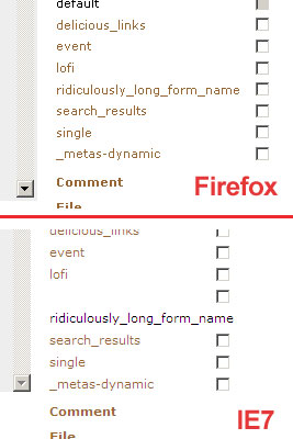
I don’t get it — there’s no width specified as far as I can make out, but maybe I missed it. So why is Firefox (correctly imo) making the right column elastic where IE gives up?
They might be ugly, but at least with tables you (sort of) know where you are! Maybe a bunch of mini-tables is the way forward — which will no doubt bring with it a number of other unforeseen issues when the tables / checkboxes themselves won’t line up because they’ll have different widths based on the maximum length of the form names in each group. *sigh*
Answers / fixes / ideas / sympathy gladly received…
The smd plugin menagerie — for when you need one more gribble of power from Textpattern. Bleeding-edge code available on GitHub.
Hire Txp Builders – finely-crafted code, design and Txp
Offline
#24 2010-03-09 16:57:06
- uli
- Moderator
- From: Cologne
- Registered: 2006-08-15
- Posts: 4,334
Re: Mild alterations to the Presentation tabs
Bloke wrote:
So why is Firefox (correctly imo) making the right column elastic where IE gives up?
You didn’t look at exactly the same form :) One time there is no checkbox to display.
In bad weather I never leave home without wet_plugout, smd_where_used and adi_form_links
Offline
#25 2010-03-09 17:00:34
- uli
- Moderator
- From: Cologne
- Registered: 2006-08-15
- Posts: 4,334
Re: Mild alterations to the Presentation tabs
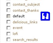
Oh, darn it:
My sympathy, honestly! :) Thanks for your commitment!
In bad weather I never leave home without wet_plugout, smd_where_used and adi_form_links
Offline

Re: Mild alterations to the Presentation tabs
phiw13 wrote:
As for the width – don’t force anything wider than 1000px.
Lower please!
I’m using a 1024×768 display. When I have a browser window maximized with a scrollbar on the right side, I can fit at most 995 pixels, so with a bit of extra margin (to account for different windows themes), I wouldn’t go wider than 980 pixels (which is a number I frequently find when Googling a bit on this subject)
Last edited by ruud (2010-03-09 20:26:52)
Offline

Re: Mild alterations to the Presentation tabs
maybe a combination of white-space: nowrap; and overflow:hidden; – that often hinders rogue line wrapping. If you have a code snippet to play with, we can experiment…
I too much prefer the checkbox on the right – it’s a secondary action “delete” whereas now on the left it looks like a selection option.
Last edited by jakob (2010-03-09 20:38:38)
TXP Builders – finely-crafted code, design and txp
Offline
Re: Mild alterations to the Presentation tabs
Bloke wrote:
I don’t get it — there’s no width specified as far as I can make out, but maybe I missed it. So why is Firefox (correctly imo) making the right column elastic where IE gives up?
Could you wip up patch of your current code ? It would be more easy for me to play along and give meaningful advice. Everything can be fixed.
On first sight, the behaviour of IE makes sense, depending on what constrain there are on the parent elements (there is a table out there)
In low-power mode.
Sand space – admin theme for Textpattern
phiw13 on Codeberg
Offline
Re: Mild alterations to the Presentation tabs
phiw13 wrote:
Could you wip up patch of your current code
You got mail.
The smd plugin menagerie — for when you need one more gribble of power from Textpattern. Bleeding-edge code available on GitHub.
Hire Txp Builders – finely-crafted code, design and Txp
Offline

Re: Mild alterations to the Presentation tabs
Maybe it makes sense to place ? next to disabled checkboxes with description – why it’s not recommended to delete this form?
Providing help in hacking ATM! Come to courses and don’t forget to bring us notebook and hammer! What for notebook? What a kind of hacker you are without notebok?
Offline