Textpattern CMS support forum
You are not logged in. Register | Login | Help
- Topics: Active | Unanswered

Mild alterations to the Presentation tabs
I’ve been thinking (dangerous!) that since the demise of the friendly CSS editor there’s very little reason for the left hand column on the Styles tab.
I’m intending to move the ‘You are editing style…’ message above the central textarea (like it is on the Pages tab). That just leaves the ‘Create new’ link which I would propose to be moved above the list on the right (like it is on the Forms tab). Doing that would mean we essentially have a 2-column display and the stylesheet textarea could be widened to fill the space left behind by the absent left column.
Questions:
- Is that desirable?
- Does it have any detrimental impact on any existing plugins/themes that you know of?
If not, I’ll go ahead and do the deed.
[EDIT: topic changed to better reflect the thread direction]
Last edited by Bloke (2010-03-08 23:13:40)
The smd plugin menagerie — for when you need one more gribble of power from Textpattern. Bleeding-edge code available on GitHub.
Hire Txp Builders – finely-crafted code, design and Txp
Offline

Re: Mild alterations to the Presentation tabs
Having the wider textarea would be great from my end. As long as the “Create new..” is at the top of the list. Don’t put it underneath.
Stuart
In a Time of Universal Deceit
Telling the Truth is Revolutionary.
Offline
Re: Mild alterations to the Presentation tabs
thebombsite wrote:
As long as the “Create new..” is at the top of the list.
Aye aye cap’n. That’s what I intended. I just tried it out: rather good.
One other small point: the text is “Create or load new style”. Any idea why “Create new stylesheet” won’t do? What’s the ‘load’ bit mean? Is it legacy wording from the old (un)friendly editor? Answers on a postcard to the usual address…
The smd plugin menagerie — for when you need one more gribble of power from Textpattern. Bleeding-edge code available on GitHub.
Hire Txp Builders – finely-crafted code, design and Txp
Offline
#4 2010-03-07 17:31:19
- masa
- Member
- From: North Wales, UK
- Registered: 2005-11-25
- Posts: 1,095
Re: Mild alterations to the Presentation tabs
Sounds good to me.
I’m all for consistency and moving the “Create new” link to the top right brings it in line with other areas.
Extra space is always appreciated.
While on the topic of extra space, I was wondering whether it might be useful/possible to widen the input field in the Forms tab to match that of the Pages tab. Somehow it always feels rather crammed to me, since it contains code fragments with indentations similar to those in the page templates.
Last edited by masa (2010-03-07 17:33:45)
Offline
#5 2010-03-07 18:18:32
- els
- Moderator

- From: The Netherlands
- Registered: 2004-06-06
- Posts: 7,458
Re: Mild alterations to the Presentation tabs
Nice idea, Stef!
masa wrote:
While on the topic of extra space, I was wondering whether it might be useful/possible to widen the input field in the Forms tab to match that of the Pages tab. Somehow it always feels rather crammed to me, since it contains code fragments with indentations similar to those in the page templates.
+1
Offline
Re: Mild alterations to the Presentation tabs
Here’s a sneak-peek of the Pages, Forms and Styles tabs in my local dev version:
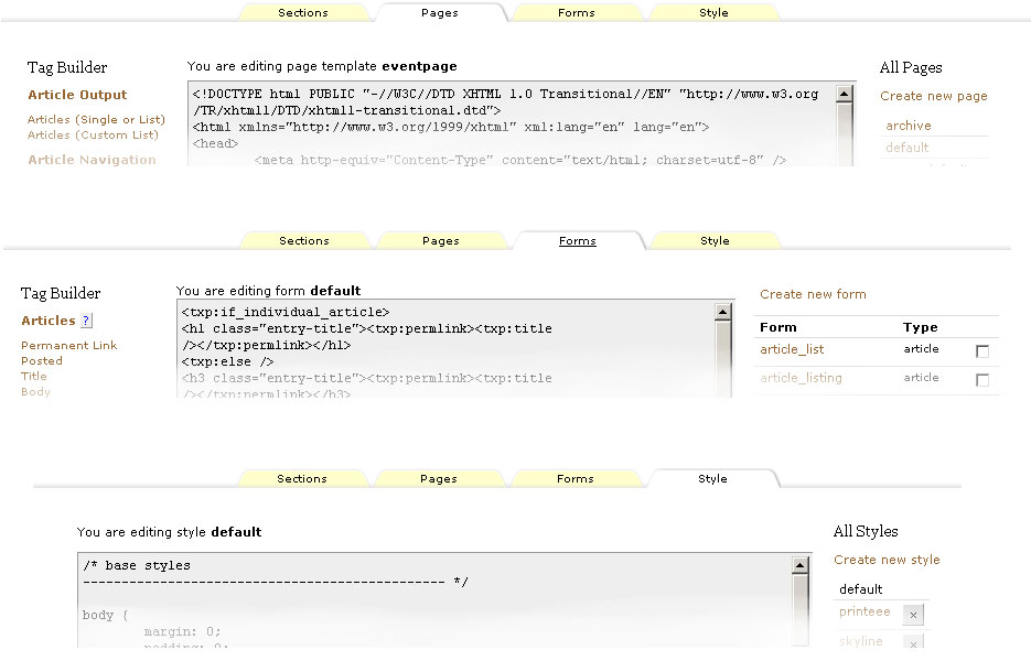
Notice there’s a bit more consistency between the panes now, with:
- Create new links at the top of the right-hand column on all tabs
- You are editing… text above all the central textareas (no idea why the forms one is squashed up… pending investigation)
- A wider textarea on the Styles tab with no left-hand-column
Making the Forms textarea wider would be nice. Not sure how much wider we can go, though. What’s the screen size we’re aiming for? Is it still 1024×768?
Any further thoughts on the above? If it’s a hit I’ll consider making it so…
Last edited by Bloke (2010-03-08 23:15:37)
The smd plugin menagerie — for when you need one more gribble of power from Textpattern. Bleeding-edge code available on GitHub.
Hire Txp Builders – finely-crafted code, design and Txp
Offline
#7 2010-03-09 00:37:53
- masa
- Member
- From: North Wales, UK
- Registered: 2005-11-25
- Posts: 1,095
Re: Mild alterations to the Presentation tabs
Bloke wrote:
What’s the screen size we’re aiming for? Is it still 1024×768?
Sounds fine as the minimum.
Any further thoughts on the above? If it’s a hit I’ll consider making it so…
I like it a lot :)
Since we have All Pages and All Styles you should perhaps add All Forms as the header, too.
Offline
Re: Mild alterations to the Presentation tabs
Bloke wrote:
…
- Create new links at the top of the right-hand column on all tabs
- You are editing… text above all the central textareas (no idea why the forms one is squashed up… pending investigation)
- A wider textarea on the Styles tab with no left-hand-column
Making the Forms textarea wider would be nice. Not sure how much wider we can go, though. What’s the screen size we’re aiming for? Is it still 1024×768?
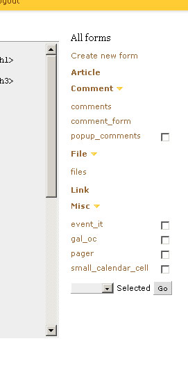
For the forms tab, have you considered making the ‘all forms’ right-hand side bar a single column ?
Something like this screenshot
(I can send you a patch, I think.) Saves tons of space. You could even make it collapsible, like the left-hand column (e.g. Write tab).
As for the width – don’t force anything wider than 1000px. Think iPad and other non desktop devices. I’ve been reworking my own admin stylesheet a little to make sure things fit on screen on the iPad.
(I don’t know yet how well it will work at the interaction level)
In low-power mode.
Sand space – admin theme for Textpattern
phiw13 on Codeberg
Offline
Re: Mild alterations to the Presentation tabs
phiw13 wrote:
For the forms tab, have you considered making the ‘all forms’ right-hand side bar a single column ?
I considered it. I like the idea a lot. It’s been requested before and I can’t remember the reason for not doing it offhand (there’s probably a thread about it somewhere).
(I can send you a patch, I think.)
Yes please, I’ll see what I can do with it.
As for the width – don’t force anything wider than 1000px
Righty-o. Noted.
masa wrote:
Since we have All Pages and All Styles you should perhaps add All Forms as the header, too.
I thought about it and then unthought about it. On one hand it adds to the vertical real estate, but then the same could be said for the headings on the Pages and Style tabs. I’d be in favour of either adding it to the Forms tab, or removing the heading from all tabs. Is it intuitive enough to go without a heading? I’m not convinced, but then what do I know about UI design!
If anybody has any further thoughts/ideas/comments on this part of the admin interface (besides “all the markup is crap!”) please share them here.
The smd plugin menagerie — for when you need one more gribble of power from Textpattern. Bleeding-edge code available on GitHub.
Hire Txp Builders – finely-crafted code, design and Txp
Offline
#10 2010-03-09 09:50:46
- masa
- Member
- From: North Wales, UK
- Registered: 2005-11-25
- Posts: 1,095
Re: Mild alterations to the Presentation tabs
Bloke wrote:
I’d be in favour of either adding it to the Forms tab, or removing the heading from all tabs. Is it intuitive enough to go without a heading?
I think, it’s intuitive enough. After all you get there by clicking the named tab at the top and that tab stays highlighted in some form. But then we have the Tag Builder heading on the other side, so perhaps it makes sense to keep the headings?
I’m also for making the Forms menu single column.
Last edited by masa (2010-03-09 09:53:42)
Offline
Re: Mild alterations to the Presentation tabs
Sneaky peeky #2 (using Remora).
Not as pretty as phiw13’s version, but styling is not my thing anyway so this is rudimentary and functional. Headings are collapsible as you can see, and the state of the individual panes is remembered, like on the Write tab. We gain an extra 60 pixels or so of width to the Forms textarea by doing this. Makes quite a bit of difference actually. Added the ‘All Forms’ heading as well, as per masa’s suggestion, and it is actually better.
The only ugly thing are the checkboxes — sometimes present, sometimes missing. The ‘files’ group looks a bit weird to me. Not sure how to get round that or if it is indeed a problem at all; perhaps subtle use of colour or lines might help? phiw13’s screenshot shows the checkboxes always present but dimmed if the particular form cannot be deleted — is that better from a UI perspective? I’m not so sure.
Any thoughts, fire them in this direction.
Last edited by Bloke (2010-03-09 11:19:03)
The smd plugin menagerie — for when you need one more gribble of power from Textpattern. Bleeding-edge code available on GitHub.
Hire Txp Builders – finely-crafted code, design and Txp
Offline
Re: Mild alterations to the Presentation tabs
For the checkboxes, I’m in favour of having them all. Those forms that can’t be deleted get a disabled=“disabled” attribute on the checkbox.
Structurally, your screenshot looks good. Are the headings (article, comment, etc) th ?
I’m also in favour of having the ‘All forms’ headline, for consistency. That doesn’t take up that much space, and as Martin notes, you’ve got the heading on the other side. Balance and all that :-).
Last edited by phiw13 (2010-03-09 12:11:10)
In low-power mode.
Sand space – admin theme for Textpattern
phiw13 on Codeberg
Offline

Re: Mild alterations to the Presentation tabs
The collapsible forms grouping is very nice to see. phiw13’s suggestion of disabled checkboxes is perhaps a good one.
Width: one of the first things I do on my own setup is make the width of the page and width of the code block elastic. The left and right columns stay fixed. That way it works with any window width, narrow or wide.
Seeing as people are getting in their requests here, the inevitable piggy-back request: one thing that would improve the handling in the code window a lot is syntax highlighting. For anything but the simplest of modifications I find myself copying and pasting out of the window and work in an editor. I have used Editarea which was included in one of the admin themes (thread here) but it’s a monster of a library and fills the window with line numbers and buttons – I find it more intrusive than it needs to be.
Is there not a customisable lightweight jquery library for this? In my view, it doesn’t need to take over the window or provide any buttons, just highlight code. It’d be nice if it allows pressing the tab key in the textarea, though. Has anyone any recommendations? Here are some I googled but I couldn’t say which is better than the others: codify, google prettify, chili, syntaxhighlighter and I’m sure the list goes on.
TXP Builders – finely-crafted code, design and txp
Offline
Re: Mild alterations to the Presentation tabs
phiw13 wrote:
For the checkboxes, I’m in favour of having them all. Those forms that can’t be deleted get a disabled=“disabled” attribute on the checkbox.
I could try that and see what it looks like.
Are the headings (article, comment, etc)
th?
No, I ditched the table markup because it was too difficult to insert the required structure inside it without incurring awkward workarounds. It’s now the same format as the tagbuilder stuff on the left: a containing <div> and then a <ul> list of items. The checkboxes are floated right inside the <li>. Could do with some more testing to see if this works across browsers first!
EDIT: here are a few lines of markup from the new screen:
<div class="form-list-type article">
   <h3 class="plain lever expanded"><a href="#article">Article</a></h3>
   <div id="article" class="toggle form-list" style="display:block">
      <ul class="plain-list">
         <li class="form-list-item odd">
            <span class="form_list_name">
               <a href="?event=form&step=form_edit&name=article_list">article_list</a>
            </span>
            <span class="form_list_action">
               <input type="checkbox" name="selected_forms[]" value="article_list" />
            </span>
         </li>

         <li class="form-list-item even">
            <span class="form_list_name">
               <a href="?event=form&step=form_edit&name=article_listing">article_listing</a>
            </span>
            <span class="form_list_action">
               <input type="checkbox" name="selected_forms[]" value="article_listing" />
            </span>
         </li>
...
      </ul>
   </div>

   // Next group here
</div>
Last edited by Bloke (2010-03-09 12:21:38)
The smd plugin menagerie — for when you need one more gribble of power from Textpattern. Bleeding-edge code available on GitHub.
Hire Txp Builders – finely-crafted code, design and Txp
Offline
Re: Mild alterations to the Presentation tabs
Bloke wrote:
No, I ditched the table markup because it was too difficult to insert the required structure inside it without incurring awkward workarounds. It’s now the same format as the tagbuilder stuff on the left: a containing
<div>and then a<ul>list of items. The checkboxes are floated right inside the<li>. Could do with some more testing to see if this works across browsers first!
Better, ‘cause you’ll run into an issue or two. Gecko 1.9.0 based browsers (firefox 3.0.x, camino 2.0.x) will drop the checkbox to the next line. Minor, as less and less people are using firefox 3.0.x, camino is still using gecko 1.9.0 as the rendering engine (yes, we’re hard at work to get it to use gecko 1.9.2). Worse: iExploder 7 and older will drop that checkbox to the next line (testcase).
possibility: swap the order – checkbox first in source, then label text [second line (li) in the test case above].
<span class="form_list_action">
               <input type="checkbox" name="selected_forms[]" value="article_listing" />
            </span>
            <span class="form_list_name">
               <a href="?event=form&step=form_edit&name=article_listing">article_listing</a>
            </span>
with the same style. You probably also want a li {clear: both;}
Other browsers don’t have any issue with your idea.
In low-power mode.
Sand space – admin theme for Textpattern
phiw13 on Codeberg
Offline