Textpattern CMS support forum
You are not logged in. Register | Login | Help
- Topics: Active | Unanswered
Changing the Categories tab
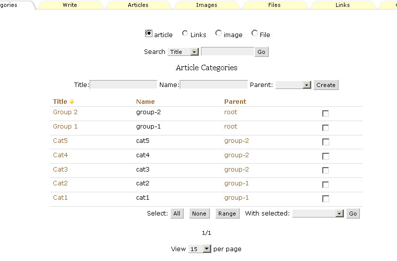
After becoming slightly disgruntled with how slow it was to create and maintain categories en masse I started experimenting on a development install. I made some hefty changes to the Categories tab to try and bring it into line with the others and hopefully improve usability.
The key things I wanted to achieve were:
- Consistent look with the other tabs (Sections notwithstanding!)
- Apply a parent category at creation time instead of having to do it in 2 steps
- Ability to alter parents of many categories at once
- Search/filter categories
What I chose to do — rightly or wrongly, you decide — was to limit the Categories tab to only show one type of category at once instead of the 4 types side-by-side as now. Features:
Radio buttonsMini tabs along the top of the page allow switching between the types (jQuery at present: all the categories are loaded at once, jQuery is just used to present them individually)- The category type you edited last is remembered, so if you come back to the Categories tab it’ll automatically show, say, Image categories
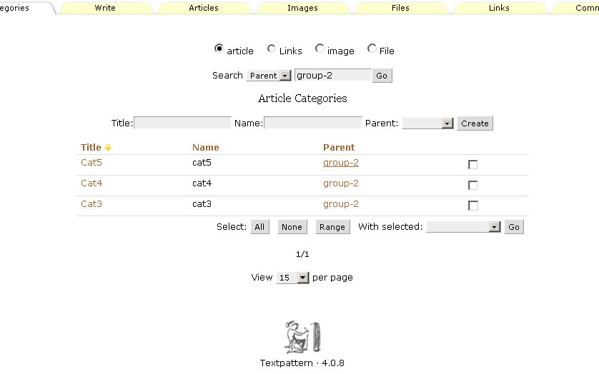
- Searching by Title, Name or Parent — clicking a parent item in the list will show only its children (haven’t figured a way of neatly returning to the entire list yet — any ideas?)
- Paging support
- Multi-select ability enables you to delete (as you can now) or move multiple categories under a single parent — not implemented yet but doable
- Title, Name and parent can be specified at creation time. If Name is omitted, the dumbed-down Title will be used as it is now. The parent last used in the dropdown could be remembered so you can quickly make many categories in the same parent category without having to keep selecting it from the list… thoughts?
- Sort order and sort column are remembered
There are a few technical barriers in the core that need to be overcome first if this is ever to see the light of day, but I (and the dev team) don’t want to address those if you think this idea is pants and there is nothing wrong with the current Categories tab.
A few screenies… firstly editing Article categories:

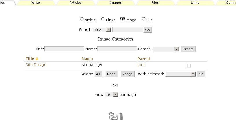
And then editing Image categories:

Clicking a parent filters the list by that chosen parent:

(ignore the weird case in the radio button names for now — haven’t made proper titles for them yet)
Please chip in and discuss the relative merits of this approach or suggest alternatives/mods, or simply tell me to leave the damn thing the way it is already ;-)
The floor is yours…
Last edited by Bloke (2009-07-13 09:19:31)
The smd plugin menagerie — for when you need one more gribble of power from Textpattern. Bleeding-edge code available on GitHub.
Hire Txp Builders – finely-crafted code, design and Txp
Offline
Re: Changing the Categories tab
Interesting idea. I’ve not given it much thought before but I’ve also never had to work with vast numbers of categories. Two loose thoughts:
- I can imagine the changed layout works well if one has either large amounts of categories (where the existing screen gets cumbersome) or works predominantly with only one category type (where most of the screen is ‘irrelevant’). The paging, sorting, remembering last category functionality would all make sense when working with large amounts of categories. Perhaps the radio buttons at the top can be proper mini-tabs like on the prefs pane…
- Otherwise, I don’t mind if the panes look different when they are about different things as it makes it visually easier for people less well-versed to know at a glance where they are.
TXP Builders – finely-crafted code, design and txp
Online
Re: Changing the Categories tab
jakob wrote:
Perhaps the radio buttons at the top can be proper mini-tabs like on the prefs pane…
Yep, better. Done.
Otherwise, I don’t mind if the panes look different when they are about different things
True, hadn’t thought of that. The variety across tabs might be more useful.
Like I say, if this idea only gets lukewarm (or ice cold) reception then that’s totally cool by me; I’ll slink away and forget it. If so, perhaps I’ll try making over the Sections tab instead, which really is a mess imho :-)
Last edited by Bloke (2009-07-13 09:17:49)
The smd plugin menagerie — for when you need one more gribble of power from Textpattern. Bleeding-edge code available on GitHub.
Hire Txp Builders – finely-crafted code, design and Txp
Offline
Re: Changing the Categories tab
Looks great (+1 on the mini-tabs).
How about another column for type? Then you could see all categories at once if you wanted, and sort on type to order them that way. Or make one of the mini-tabs “show all” to give that option.
Does get one thinking about larger issues of how categories work in Txp, but that’s for another day. With categories as they work now, this would be a major improvement. Please keep going with it.
Code is topiary
Offline
Re: Changing the Categories tab
jsoo wrote:
How about another column for type?
I did consider this as an alternative approach, good to know I’m not alone!
If people don’t like seeing the cats one by one then it’s the best solution. I could then add the ability to filter by type, would need to add a type to the ‘create’ line (which could be remembered so you don’t have to keep selecting it) and perhaps clicking a type would auto filter (the same way the parent does).
I like the idea of the ‘show all’ too. Where would you put it?
Does get one thinking about larger issues of how categories work in Txp
I hear ya and share those views ;-)
The smd plugin menagerie — for when you need one more gribble of power from Textpattern. Bleeding-edge code available on GitHub.
Hire Txp Builders – finely-crafted code, design and Txp
Offline
Re: Changing the Categories tab
Bloke wrote:
I like the idea of the ‘show all’ too. Where would you put it?
Along with the other select-by-type controls — radio buttons as you have it now, or mini-tabs as jakob suggests.
Last edited by jsoo (2009-06-10 14:21:26)
Code is topiary
Offline
Re: Changing the Categories tab
Intriguing. I can see some major advantages, and would be supportive of your renovations :) The current setup can get unwieldy on some sites.
Convenience-wise, I often create the same category across my content (articles, images, files). It would be nice to do it in on step (pure laziness on my part :D ). But that may not be doable, or desirable beyond my work flow.
Offline
Re: Changing the Categories tab
maverick wrote:
Convenience-wise, I often create the same category across my content (articles, images, files). It would be nice to do it in on step (pure laziness on my part :D ). But that may not be doable, or desirable beyond my work flow.
It’s not just a convenience — it would make a lot of sense for categories to span content types. That’s one of the points I was thinking about when I mentioned “larger issues” pertaining to Txp categories. But your suggestion to have an option to create a category for all types at once is a good one. Add another drop-down list to the “create” line, containing the content types and with an “All” option.
Code is topiary
Offline
Re: Changing the Categories tab
+2 good on ya bloke for choosing one of my most wanted…
…global cats (not felines), make a client/member login section much easier to build and maintain, as would your rearrangement even without thinking about global cats at all. All good ideas.
Offline
Re: Changing the Categories tab
At least multi changing parting category should be implemented.
Providing help in hacking ATM! Come to courses and don’t forget to bring us notebook and hammer! What for notebook? What a kind of hacker you are without notebok?
Offline
#11 2009-06-11 10:51:41
- jpdupont
- Member
- Registered: 2004-10-01
- Posts: 752
Re: Changing the Categories tab
+1 for Stef !
+1 for global cats !
Offline
Re: Changing the Categories tab
maverick wrote:
Convenience-wise, I often create the same category across my content
Me too. Useful to link things together, I find.
It would be nice to do it in on step
I agree. It’s doable because all you do, programmatically, is add and reindex the category table 4 times when you hit Create after choosing “all” from the dropdown that jsoo mentioned. Another option — and one I tried in smd_tags with only partial success — is to create a 5th type that is visible across all Tabs that deal with categories. But that’s potentially a major alteration to the core because every tag that uses a category probably needs changing… if we go that way we might as well do unlimited cats once and for all. Maybe another day!
I also agree with the_ghost that even if the tab rearrangement isn’t implemented that change_parent should be in the with_selected list. That would go a long way to solving most of the issues I have with the screen simply because I could create a tonne of categories and then park them under one roof in a single step. Albeit that I’d have to still individually click each one because the ‘range’ option would be unavailable.
I do like the idea of having all the types listed together in the table — and having a ‘type’ column and thus using the buttons along the top as shortcuts for filtering — but there’s a major problem as far as I can see: the with_selected list in this scenario. What if you tick 3 article categories and 4 image categories, then tell the multi_edit thing to change them all to the parent “shop”, but that category is only defined for articles? How does it perform the action?
With the switchable lists there is at least the option of knowing which parents are available to which type, so perhaps having them ‘separate’ is the only way to go if a mass change_parent is to be implemented? Unless someone can come up with a clever system to overcome this…?
Last edited by Bloke (2009-06-11 14:56:33)
The smd plugin menagerie — for when you need one more gribble of power from Textpattern. Bleeding-edge code available on GitHub.
Hire Txp Builders – finely-crafted code, design and Txp
Offline
#13 2009-06-11 18:40:46
- masa
- Member
- From: North Wales, UK
- Registered: 2005-11-25
- Posts: 1,095
Re: Changing the Categories tab
Bloke wrote:
The key things I wanted to achieve were:
- Consistent look with the other tabs (Sections notwithstanding!)
- Apply a parent category at creation time instead of having to do it in 2 steps
- Ability to alter parents of many categories at once
- Search/filter categories
All excellent enhancements that get my vote as well as Jakob’s mini-tabs.
Offline
Re: Changing the Categories tab
+2
Patrick.
Github | CodePen | Codier | Simplr theme | Wait Me: a maintenance theme | [\a mi.ni.ma]: a “Low Tech” simple Blog theme.
Offline
Re: Changing the Categories tab
I have a lot of categories in a tree structure, which makes it easy to find them if they are displayed in a tree structure as they are now.
Offline