Textpattern CMS support forum
You are not logged in. Register | Login | Help
- Topics: Active | Unanswered
[contrib] Textpattern.org Tabula Rasa userstyle
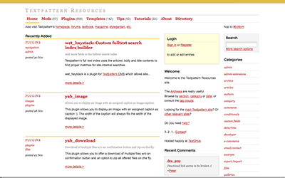
After completing the userstyle for these forums, I took a shot at prettying up txp.org. I carried on the same style of the forum userstyle – it’s all white, with some yellow lines here and there. No more Baar Sophia section titles — I always thought those were terribly pixelated and poorly suited for display type of the site. Fixed width has been implemented and I’ve tried to keep it to a 6 column grid. Here’s a screenshot of what the site looks like with the userstyle installed.

Like others, I think textpattern.org is long over due for a re-haul. Digging into the HTML and CSS of the site, it seemed way too complicated for what was being presented. Once I get a chance, I might try contacting Alicson to see what changes we could make to clean it all up.
Txp admin themes | dropshado.ws – a blog for design noobs like me
Offline
#2 2008-12-07 21:52:13
- els
- Moderator

- From: The Netherlands
- Registered: 2004-06-06
- Posts: 7,458
Re: [contrib] Textpattern.org Tabula Rasa userstyle
I think it’s definitively an improvement, very nice and clean! Though personally I’d prefer the default TXP brownish for the link colour, it’s an awful lot of red!
Offline
Re: [contrib] Textpattern.org Tabula Rasa userstyle
Thank you! I’m using both the resources and forum scripts, though I also replaced the link color.
TXPDream – A Textpattern Tag Library for Adobe Dreamweaver. (updated for 4.2.0) | jdw_if_ajax – Only serve certain parts of a page when requested with AJAX
Offline
Re: [contrib] Textpattern.org Tabula Rasa userstyle
Both are great, Dave.
I prefer the brown links too, and since the brown is defined in the txp style guide (loosely defined in wet’s wiki somewhere), it only makes sense to go that way.
Now if we could get the forum and .org to adopt the styling and implement whatever masthead navigation Matthew is working on across .com, .net and .org, then we at least look like we know what we’re doing even if the IA is off kilter.
Last edited by Destry (2008-12-10 20:28:18)
Offline
Re: [contrib] Textpattern.org Tabula Rasa userstyle
Red links are now back to brown. Thanks to your input!
Txp admin themes | dropshado.ws – a blog for design noobs like me
Offline