Textpattern CMS support forum
You are not logged in. Register | Login | Help
- Topics: Active | Unanswered
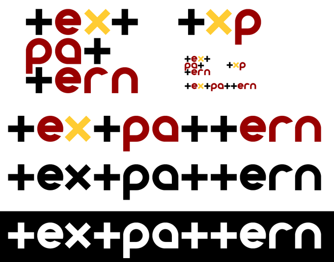
Alternate TXP logo, just for fun
Let me preface this post by emphasizing this logo is in no way official, or is it a potential comp that is being considered by the TXP team. It is not related to the recent opportunity to tweak the current logo.
During all the redesigning hub-bub over the past month, I got excited enough to try designing a different logo.

And to address what-I-guess-will-be your first impressions — yes, it’s very Web 2.0. Too cutesy to fit inside the current branding. But here’s my pitch.
The logo basically is a play on “Textpattern” the word itself. The letter T appears four times within the brand name, so there’s a pattern right within the letters. Reforming the T’s as crosses helps establish these elements more as basic shapes than as letters. That pattern is reinforced by separating the other round letters. The viewer immediately can group the letters into two distinct sets – the crosses and the round letters. And the X brings it all in, by sharing (nearly) the same shape as the T. The 3-line version (text/pat/tern) takes the letters-as-shapes idea to its limit and places them in a grid. But the pattern is still readily visible when the letters are arrange straight in a row, even without the 3 colors.
The logo also works as an allegory, one that speaks to the capabilities of Textpattern. The user implements one element (the T) multiple times. This could be a page template or CSS or form. Then the user can create a very specific variation off of that element (the X).
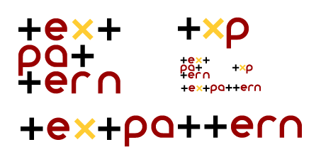
I realize this logo would be used primarily in small application – as little images in the footer of web pages, and the top corner of the admin. The version above falls apart when shrunk, but I do have another one that has a thinner weight with more kerning that holds up pretty well.

Neither is perfect, there are plenty of awkward kerning and spacing issues with both. Again, I don’t think the current logo needs to be thrown out or anything. In fact, I quite like it. But I figured others would be interested to see something new. I’m currently in school for graphic design, so all comments or suggestions would be appreciated.
Txp admin themes | dropshado.ws – a blog for design noobs like me
Offline
Re: Alternate TXP logo, just for fun
Hi dave.
I think the pattern of t’s concept is good but your running into some problems visually. The letters dont gel into a word but are separated from each other visually.
One reason is that the t’s are very linear especially next to the curves of the other letters. So i think because of that and because of the color differences it looses readability. Maybe try your concept with a font like Van Doesburg (spelling) Its a good exercise to play with logo’s especially when your studying.
Here is one i was freestyling with, i know its way off as well just playing around:
The x becomes a tag closing and opening bracket.

If the logo is changed at all i think the “headstone” is the bit that should go.
It makes the logo feel very heavy and maybe even a bit morbid.

there might be some creative possibilities for things that can come from the tip of the chisel.
Last edited by kvnmcwebn (2008-10-15 14:20:08)
its a bad hen that wont scratch itself.
photogallery
Offline
#3 2008-10-15 17:43:16
- els
- Moderator

- From: The Netherlands
- Registered: 2004-06-06
- Posts: 7,458
Re: Alternate TXP logo, just for fun
Hi Dave, I am by no means an expert, so no feedback from me but this: I like it :)
Offline
Re: Alternate TXP logo, just for fun
I like Dave’s efforts too, particularly the full-word versions (love the white-on-black). The other patterns could be a little confusing to anyone that doesn’t already know what they say though I think the TXP works fine.
I also like Kevin’s first example, nice and bold. Not too sure about the coloured ones.
Last edited by thebombsite (2008-10-15 20:30:22)
Stuart
In a Time of Universal Deceit
Telling the Truth is Revolutionary.
Offline
Re: Alternate TXP logo, just for fun
nemoorange
Yeah, I’m down with that too. Like thebombsite says, I find the +‘s aren’t immediately distinguishable as t’s, so it kind of looks like a regular expression to me (damn coding mentality!). But it’s quite striking. Good stuff.
kvnmcwebn
Love your stark, bold first one with the angle brackets as the ‘X’. Punchy.
Last edited by Bloke (2008-10-15 21:30:09)
The smd plugin menagerie — for when you need one more gribble of power from Textpattern. Bleeding-edge code available on GitHub.
Hire Txp Builders – finely-crafted code, design and Txp
Offline
#6 2008-10-15 22:29:00
- masa
- Member
- From: North Wales, UK
- Registered: 2005-11-25
- Posts: 1,095
Re: Alternate TXP logo, just for fun
Hey, I like these ideas!
I always found the carver (squareish) and the type (longish) were separate entities and a bit difficult to combine. But what about a squareish, type-only, stamp-like logo in a 4/3 matrix like…
+ex+
pa++
ern!
(just a mono-spaced dummy without actual fonts)
?
Last edited by masa (2008-10-15 22:36:37)
Offline
Re: Alternate TXP logo, just for fun
Wow, fun thread.
@nemoorange: Great initiative. Before reading your explanation, I was immediately struck by the same notions shared by Stuart and Bloke. Even now my eyes only seem to focus on “ex-pa-ern,” which when said with an Apalachian backwoods drawl could end you up in a “squeal” scene for Deliverance 2.
@Keven: Again, agree with the others. The very first one is the most effective, and I don’t think it’s so outside the ideals of why the current logo is what it is. In other words, I think this is a workable idea. Furthermore, I have always liked the chiseler* guy (probably in the minority), but I love that first one where he’s just the upper-body only. Perfect. Really cleans it up. Ed. Hmmm. With the chiseler like that, you could even move him down and left to the text so the bottom of his back was near the “T” and the bottom of the stone was near the “P”. I’m just visualizing it, but it could make a nice asymmetric effect.
*He’s chiseling, not carving, folks; that heavy downward hammer stroke is definitively chiseling. In any case, you only carve wood, never stone (engrave maybe, but never carve – unless you’re a skateboarder). Just to clear that up. :)
Last edited by Destry (2008-10-15 23:26:22)
Offline
#8 2008-10-15 23:32:10
- masa
- Member
- From: North Wales, UK
- Registered: 2005-11-25
- Posts: 1,095
Re: Alternate TXP logo, just for fun
I agree that the plus sign might be difficult to decipher as a “T”. For an interesting design combining upper- and lower case, see the NeXT logo
Offline
Re: Alternate TXP logo, just for fun
Wow! I liked both approaches.
nemoorange: the font is very nice. Although I like the colors, maybe it could have just yellow and black. Something like textpattern (the “text” in yellow, the “pattern” in black, or viceversa), or maybe textpattern. I like it, it looks like a toy brand, it looks like fun (textpattern is fun, and fun rulez).
Kevin: I like the chiseler guy (thanks Destry for the wisdom) without the stone… I think it goes with the idea of the empty canvas. I also like the yellow mark under the chisel, it goes with the branding.
About the TXP logo using the brackets, I would like to see a version in lowercase and maybe with a font that looks more like real code. Something like this t><p (yup, it doesn’t look so nice, he).
Offline
Re: Alternate TXP logo, just for fun
I like the yellow track or whatever under the chisel. How about this variation which has more overt symbolism. Textpattern is the work bench upon which masterpieces are produced as a matter of routine.

Dave, I like your innovation but feel that it falls too far from the path for comfort and continuity; perhaps that’s what innovation is all about.
Offline
Re: Alternate TXP logo, just for fun
Destry wrote:
Ed. Hmmm. With the chiseler like that, you could even move him down and left to the text so the bottom of his back was near the “T” and the bottom of the stone was near the “P”. I’m just visualizing it, but it could make a nice asymmetric effect.
That didn’t work as well as I thought. (Ed. Image removed)
Kevin, if you don’t mind and there was no objections otherwise, I would like to see what the half-body chiseler would look like as a favicon for TextBook (if it’s not to cramped). If that’s OK, could you upload one here for me to grab. Thanks.
Last edited by Destry (2008-10-16 12:40:51)
Offline
Re: Alternate TXP logo, just for fun
Well heres couple more variants:

I thought about it more and Textpattern is better represented by the hammer than what the man is creating with his chisel.
Destry I sent an email message from your site.
its a bad hen that wont scratch itself.
photogallery
Offline
Re: Alternate TXP logo, just for fun
Oooooo ! The golden-hammer. Nice touch. Really polishes it. I like the second one best; just the gilded hammer. And the centered icon does look good. I’m canning that image of mine. :)
Haven’t seen the mail yet, but my mail server’s been kind of sluggish the last two days anyway. We’ll give it some time.
Offline
Re: Alternate TXP logo, just for fun
Kevin – I don’t know if it’s me but those 2 images look the same?? I do like the golden hammer touch.
Last edited by thebombsite (2008-10-16 15:33:06)
Stuart
In a Time of Universal Deceit
Telling the Truth is Revolutionary.
Offline
Re: Alternate TXP logo, just for fun
thebombsite wrote:
Kevin – I don’t know if it’s me but those 2 images look the same?? I do like the golden hammer touch.
hi,
the only difference is in the stroke the one on top has a bit of yellow in it. doesnt really do anything for it though.
its a bad hen that wont scratch itself.
photogallery
Offline