Textpattern CMS support forum
You are not logged in. Register | Login | Help
- Topics: Active | Unanswered
#76 2006-06-09 09:26:35
- rui
- Member

- From: Espinho, Portugal
- Registered: 2005-04-28
- Posts: 65
Re: Admin Facelift. Take 3
Ace of Dubs wrote:
Splash

Hi Ace,
Please don’t forget that txp is used in languages other than english.
The top left zone in the proposed mock-ups may not have sufficent space for the site name and the username (see the red lines in the image below – portuguese txp admin).

All the Best,
rui
Offline
#77 2006-06-09 11:47:04
- Ace of Dubs
- Member

- Registered: 2006-04-17
- Posts: 446
Re: Admin Facelift. Take 3
Good call, Rui. Changed the layout.
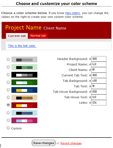
Also, I been doing some thinking and an “Upload Theme” Button is not the best way to add styles. Instead, we should have a theme folder which TXP reads (exactly how PunBB does it) You can upload your CSS files directly to this folder and they will appear in the dropdown menu. Inside the Theme folder, there will be an image folder where you will group images by theme and link them to your CSS.
I have a photoshop template that is sliced up to contain the rounded corners and icons. All colors are grouped together by layer and their transparency is blocked, so you can instantly fill them with whatever color you want, then “Save for Web” and save all the slices into your new theme folder. The CSS is already coded to look for the resulting slices. All that’s left to do is Search/Replace your link to the new folder within your CSS doc and that’s all.. With this system in place, you will essentially be able to create your own themes in minutes!
In regards to the Icons On/Off buttons, I think they will also be un-necessary, because not all themes will have icons in them. Instead we should rely on naming conventions. (Hot Cocoa, Hot Cocoa + Icons)
Eventually we can set up a download page where people can preview and grab only the themes that they want. This way we don’t bloat up installs with a bunch of useless files. A link to this page will show up on the admin, like so:

Having said all that, I think the default install should come with 4 themes. One in the original TXP yellow and the rest in various themes which will cover the bases for all color-blind issues. Not sure if PunBB does polls, but later on I will make a thread where we can vote on which themes will get default status.
Offline

Re: Admin Facelift. Take 3
Just noticed this thread, and the other one of Mary’s – lots of great examples – and it reminded me of an experiment of my own a while ago.
I like the idea of your photoshop template with the colours showing through. If one kept the design simple enough could you not bypass the photoshop file entirely and use ‘knockout’ transparent png’s along the lines of Logo Colour Variations or the SimpleBits Chameleon Icons, i.e. a white mask where the colour or background beneath shows through?
Then the key colours and background colours could be set in a css file or via admin fields, and if you added a background url, then you could even insert background patterning or a company logo.
Basecamp does soemthing similar, and offers fields where you can enter a handful of colours for the header and upload a logo. It works partly because they’ve kept things like the tabs really simple, and partly because they’ve also restricted the user’s changes to certain elements of the UI and left others to remain consistent. I gess that’s all doable by grouping these in the css file:
(pic links to larger image with schema)
Design-wise, I think it’s really important that the focus is still on the text fields and the most important action (i.e. save) and not on the controls or side panels. I find that clients are a little baffled by all the possibilities on the interface to start with as it is (would love to be able to switch off what’s not needed). It should be really clear where they should type and where they should save, change, assign, select or whatever. The other things should not compete for attention.
Also, vertical height of the top will I think be less and less of an issue as screen real estate goes up. But as the resolution of the screens increases (new laptops are now around 114dpi no longer 72dpi), the font-size will get ever more important (i.e. should be bullet-proof sizeable).
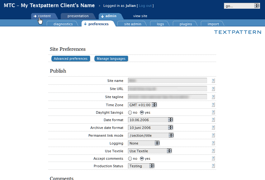
Getting things to work across all browsers, and making them bulletproof at different sizes is really difficult :-) I know, because I’ve tried it, and not made it all the way. This was my try on the txp admin, that I played with some months ago:
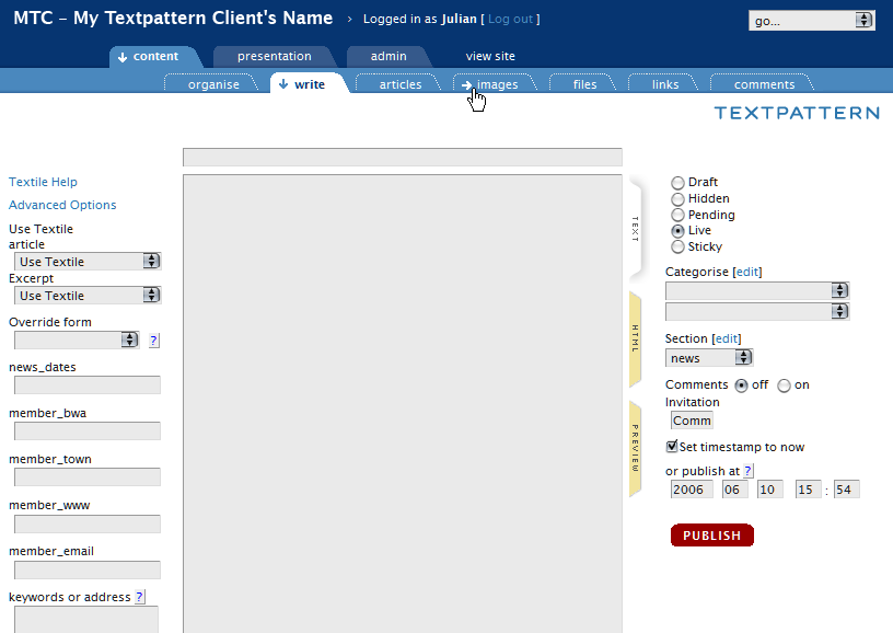
… and the articles screen
(pics link to full-screen images)
I came across some similar design decisions, such as login at the top (I removed the footer entirely), site/company name at the top, tiered tabs giving most focus to what’s in use, subdued display of other tabs, handling of ‘view site’ tab (not really a tab, rather an external link so it has no tab and a different roll-over arrow). To avoid the txp and company logo clash, I shifted my version of the textpattern logo from the top strip to another still prominent but out of the way location at the top-right of the tab itself (perhaps cut-off here in the thread preview pic).
Last edited by jakob (2006-06-10 16:31:42)
TXP Builders – finely-crafted code, design and txp
Offline
#79 2006-06-10 17:17:51
- marco
- Member
- From: Montreal
- Registered: 2004-02-24
- Posts: 62
Re: Admin Facelift. Take 3
Jacob and others who posted snapshots, are these admin themes available anywhere for download?
They look awfully good to me, I have not had time to go throug the entire thread, I’m ready to download an test them.
Offline
#80 2006-06-10 19:26:12
- Ace of Dubs
- Member
- Registered: 2006-04-17
- Posts: 446
Re: Admin Facelift. Take 3
Excellent work there, Jakob. Out of curiosity, do you have any code for these comps? I am in the process of building the templates, making them scalablle/bulletproof and of course IE-friendly. I like the way you are thinking and am sure your code will provide some extra insight.
Offline

Re: Admin Facelift. Take 3
my mouth is watering!
~~~~~~~~~~~~~| monolinea.com | pixilate.com | istockphoto.com/kemie |~~~~~~~~~~~~~
Offline
#82 2006-06-10 19:53:44
- Nonsense
- Member
- Registered: 2005-11-25
- Posts: 53
Re: Admin Facelift. Take 3
Some very good points there Jakob.
I like the idea with the arrows indication the browse-position. In fact I like it more than just plain icons which tend to get a bit messy.
Last edited by Nonsense (2006-06-12 10:07:41)
Offline
Re: Admin Facelift. Take 3
marco, there’s not really enough there to constitute a theme – it worked for my purposes (i.e. firefox and not IE) and would need plenty of tidying up to work in other browsers and be bulletproof with font-sizing etc. Some of the suggestions I made were ideas that arose doing it – i.e. not implemented (… begins to eat hat …). I’d love to work it up more but I just know that if I start, my nights will grow ever shorter …
Anyway, I’ll send ace of dubs my files. Maybe he/she can make more of them, if desired, that is.
(this version had different tabs and the dotted outline as rollover and otherwise no background tab, so it was a bit less ‘active’ on the eye).
Just for fun, and more background, here’s another tab variation I had photoshopped at the time and then decided not to pursue, not so much because I didn’t like it, but making bulletproof tabs that have non-straight sides is very difficult. If just the top corners are styled and the edges are straight (like the presentation and admin tabs) then the ‘sliding door’ tab can slide left and right and the bottom simply extends beneath the upper ‘edge of the card’ below. If the bottom corners are styled too, then horizontal and vertical sliding is needed at the same time – that quickly gets complex (check out those rounded corner css-tricks – most have lots of extra, and unnecessary, markup to provide hooks for the background css images). Possibly the sloped tab version works if you can do without a few pixels of shadow at the crossover of slant and shadow line (which if you look closely are missing in the post above). Maybe a combination of sliding doors for the sides and mozilla’s corner-drawing css would get that effect to work in mozilla – again, it’s an effect. End of the story: simpler forms are easier to achieve – cue ace of dubs’ version.
Thinking about the idea of the knockout png files, I’m not sure that it works for the second level of tabs when they have a colour, as somewhere you will have to make a colour decision that is ‘hard-written’ into the png, not unless you can make a non-colour dependent alpha mask (trying to get my head around that concept). Maybe another design-approach where the first and second-level tabs are more similar (like they are as standard) would make that concept workable.
TXP Builders – finely-crafted code, design and txp
Offline
#84 2006-06-11 18:35:12
- marco
- Member
- From: Montreal
- Registered: 2004-02-24
- Posts: 62
Re: Admin Facelift. Take 3
jakob wrote:
“…I didn’t like it, but making bulletproof tabs that have non-straight sides is very difficult. …”
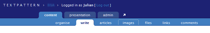
I know the nifty cornes cubes produces very nice, rounded corners, at least on the top, but maybe it could work on the bottom as well; see example4.
I am wondering if would work for your second alternative; b.t.w., it is another very nice example of what TP admin might looks some day.
Offline
Re: Admin Facelift. Take 3
Nice idea, marco. I’m not sure if the concept of nifty corners could produce outward curves as they are notionally ‘outside’ of the element. To stay within the element it styles, it would have to fill out a complex masking shape.
But: the tabs in Example 4 could be an excellent way of doing simple top-rounded tabs like of ace of dubs has them and still retaining colour control via css, particularly as nifty corners no longer needs colour definitions in the new version (i.e. can detect the colour). If I understand it correctly, it uses no images and works with unobtrusive js, so there’s no extra markup. Non-supporting browsers and those without js see normal square tabs. From the other examples, it looks like it can be combined with graduated backgrounds, so things like graduated tabs, the hover arrow or the shadow line across the bottom may also be possible.
The second alternative (and the angled one too) would work as normal ‘sliding doors’ if one is content to have fixed-height tabs (like it is now). The font-size and width could still size up but at some point it would overlap with the height. It depends how much one needs to size it up. In actual fact, the tabs probably run on to two lines before that happens.
<small>I’m sorry, ace of dubs, I really did not mean to sidetrack your thread.</small>
TXP Builders – finely-crafted code, design and txp
Offline
Re: Admin Facelift. Take 3
don’t think javascript is the way to go to round corners. seems like overkill to me. a simple sliding-doors approach seems as bulletproof as you can get…
~~~~~~~~~~~~~| monolinea.com | pixilate.com | istockphoto.com/kemie |~~~~~~~~~~~~~
Offline

Re: Admin Facelift. Take 3
Regarding the latest mockup in #77 (and this comment applies to a few other mocks before), I must admit that I think you’ve overstyled the admin pages. I like how only the menus up top are really styled and “flaired-up” while most of the main admin controls below are styled minimally in the current TxP admin sections. I think it would be better to keep the controls simple. Just IMHO.
But otherwise, I love what you guys have been coming up with. Awesome. I hope to see this in a future release. :-)
Last edited by dreamstormer (2006-06-12 09:52:15)
“The neighboring marshmallow factory fared no better, having been unable to absorb the incredible pressure wave.”
Offline
#88 2006-06-12 10:10:42
- Nonsense
- Member
- Registered: 2005-11-25
- Posts: 53
Re: Admin Facelift. Take 3
I’d go with Ace’s layout since it seems more contemporary than other suggestions so far.
The nifty corners are indeed a great way to produce a stable solution for the rounded corners issue.
Offline

Re: Admin Facelift. Take 3
Obv, I think an admin facelift is a first-class idea :) I guess I will post the modified version that I use if it might help prompt some ideas. It is not very Textpattern-ish: it is purely grayscale so I don’t have to re-theme it for different client brands. And it scales to the size of the screen. Anyway, check it out.
Travel Atlas * Org | Start Somewhere
Offline
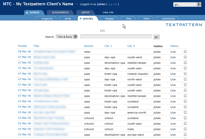
Re: Admin Facelift. Take 3
For what it’s worth, my favorite version is the one posted by rloaderro. There’s a lot of vertical space used but I imagine that’s because it has been skinned for a client install. Especially appealling to me is the simplicity of its look and feel. I’ve loved the direction Ace has been taking things but it seems like the simplicity of things has been eroding.
Press on all; design by committee has got to be the hardest way to design anything.
Offline