Textpattern CMS support forum
You are not logged in. Register | Login | Help
- Topics: Active | Unanswered
#1 2008-08-26 14:29:59
- stopsatgreen
- Member
- Registered: 2008-07-03
- Posts: 50
[contrib] Improving textpattern.org - Stage 1: Grey box layout
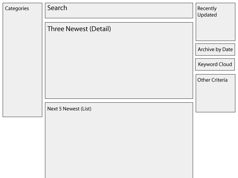
After spending a week or so looking at what textpattern.org does, reading feedback from users here, and just using it myself, I’ve been doing some sketches of how I think the layout could be improved, and have put together this grey box layout for discussion.
Please bear in mind this does not show any detail, I wanted feedback on layout before I got to that. I haven’t included the page header or footer, only the main content area. Also, this assumes that it will be only for the Plugins area. With those provisos, let’s move on to the explanation.
The main motivation for the changes are to improve findability – that is, how do people find the plugin they want – or, perhaps, didn’t know they wanted.
To that end, I suggest two key changes:
- Move the Categories navigation to the left. This is a more conventional position for the navigation, and will make it easier for users to drill down and get closer to their desired target.
- Make the search box more prominent; larger, ‘front and centre’. Helps search-savvy users – of which there are a lot – to get where they’re going quicker.
The main area – top three articles in detail, next five as a list – are a straight lift from the current site, although now given prominence in the centre of the page.
After that, I suggest the right-hand panel becomes context-sensitive; on the home page, here, it shows recently-updated modules, links to date and keyword archives, plus has space available for other findable criteria.
After hearing feedback and discussion on this, I next propose to create a wireframe with more detailed entries.
Offline
Re: [contrib] Improving textpattern.org - Stage 1: Grey box layout
A couple comments off the top…
- I think you should avoid a long scrolling page where possible. A good model that seems well-adopted in a lot of popular sites is to have a single, full article on the main page (the current article), and then a list of the “x” latest to the side and not the bottom where it’s well out of the user view (think how it would be with 3 full articles). The question I guess is what constitutes a “full article”, but again the objective should be a page with minimal scrolling within reason.
- I’ve personally never understood the popularity of clouds except they give people something to stick on their site and style when they can’t otherwise think of anything stick on their site. I recently witnessed a large group of usability experts discuss tag clouds in a private mail list, and there’s a lot of skepticism about the utility of clouds (albeit a lack of real testing). The first thing you have to determine is what does the larger cloud mean?. In my view, the only acceptable use would be as a categorical grouping, but if we already use categories, then what’s the point? Clouds are probably just redundant pollution.
Offline
#3 2008-08-26 15:53:10
- stopsatgreen
- Member
- Registered: 2008-07-03
- Posts: 50
Re: [contrib] Improving textpattern.org - Stage 1: Grey box layout
Thanks for the feedback; really useful. Quick response from me:
- I don’t intend to have as much detail in the Three Newest area as there is currently; I’m thinking it would use a summary of the plugin instead of the full description. This way the page won’t be too long.
- I should have made clear this would be a link to the keyword cloud, rather than a cloud itself. I did consider having a popular keywords cloud in this position, but decided against it for the very reason you’ve given. Having a link to a separate page would be a good alternative for those who like to use them.
Offline
Re: [contrib] Improving textpattern.org - Stage 1: Grey box layout
I also don’t see the value, in this case, for an archive by date. The real question and thus focus of the content here is “what functionality does this plugin provide?” A date does nothing to answer that question. A plugin could have been created 5 years ago, but so what? All I want to know is what it does (the function) and if it’s still usable with the latest release of Txp. So what would really be powerful in the interface is some kind of quick summary cross-referencing tool for function and version compatibility. I don’t know what that would be, but it would be useful.
I think if you dropped that and the tag clouds, you could put the “Latest X entries” to the left column and not have too much imbalance to things, nor would you lose anything meaningful.
Last edited by Destry (2008-08-26 16:02:49)
Offline

Re: [contrib] Improving textpattern.org - Stage 1: Grey box layout
Yes to making search more prominent, and significantly enhancing its features for search within sections, fitting specific versions, etc.
Are you arguing for a tag list over a tag cloud, or no representation of tags at all? I find the cloud format useful because it’s a very easy navigation tool to access common and less common tags.
I agree that quick summary/cross-referencing for function and version compatibility are important.
It can be argued that an archive by date should not be a prominent feature on the site, but I don’t know that I would discard it altogether. Personally, I rely on being able to find a plugin based on its age, and that also makes it easy to compare which were available when.. Probably not so relevant to new users, or people who don’t care for any of the older plugins, but I (and I’d think I’m not unique in this?) am not done with those.
Anyway, tags and clouds and archive options will all be relevant items for discussion a little ways down the road. ;) First things first is who will actually be working actively on the team to effect or consider all these suggested changes?
textpattern.org :: find and share Textpattern resources
docs.textpattern.io :: Textpattern user documentation
Offline