Textpattern CMS support forum
You are not logged in. Register | Login | Help
- Topics: Active | Unanswered
Pages: 1
TXP admin design
Hey I’ve been working on a modified Textpattern back-end that uses really clean and simple HTML & CSS so that you get a really clean and minimal admin panel, that can be easily modified should you desire to, it’s fluid and so takes full advantage of your screen estate.
Here is a quick preview (coded up), anyone got any feedback/ideas of how they think it could be improved?
http://driz.co.uk/txp.png
~ Cameron
Offline
Re: TXP admin design
looks nice and clean at the moment :-) I guess you need to try it out with a few more controls to see if stays that clean without compromising usability.
BTW: I’m guessing you’re using webkit’s/gecko’s/css3 drop-shadow for the main boxes?
Last edited by jakob (2009-02-01 23:54:23)
TXP Builders – finely-crafted code, design and txp
Offline
Re: TXP admin design
Yeah its CSS3. The idea is to make it incredibly lightweight, so that it can be styled to users likings.
Hopefully I’ll be able to upload a demo soon.
Last edited by driz (2009-02-02 00:24:51)
~ Cameron
Offline
Re: TXP admin design
any other feedback?
~ Cameron
Offline
Re: TXP admin design
- Id like to see the txp brand colour somewhere.
- Also install plugins like upm_image and others which appear in the write tab. One thing none of us want is to break existing functionalities:)
ps… Nice design:)
Last edited by colak (2009-02-02 18:08:54)
Yiannis
——————————
NeMe | hblack.art | EMAP | A Sea change | Toolkit of Care
I do my best editing after I click on the submit button.
Offline
Re: TXP admin design
1. Where is left column?
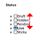
2. I’d prefer to add a little space between statuses:
3. 
4. Nice sight!!
Providing help in hacking ATM! Come to courses and don’t forget to bring us notebook and hammer! What for notebook? What a kind of hacker you are without notebok?
Offline
Re: TXP admin design
The design isn’t finished so they’re will be spacing soon :)
And their is no left column, just a main content and a sidebar, my plan was to keep it minimal! However, I’m trying out a design with three columns. x
Update: Added the left column, and added some styling to the form elements, in the final version all aspects of the admin panel will be theme-able.
Last edited by driz (2009-02-02 20:36:52)
~ Cameron
Offline
Re: TXP admin design
Update: http://driz.co.uk/txp.png
Added the entire right column!
Last edited by driz (2009-02-05 14:43:20)
~ Cameron
Offline
Re: TXP admin design
Needs less clutter, more whitespace, and bounds more organization. It looks identical, with the exception of colors to the standard TXP UI. Step outside the native TXP look and imagine something completely different.
Offline
Pages: 1